Shattered In the Mid-1970s
Splurging on Letraset in the production room of a small newspaper.
By Russ Smith

A few weeks ago I ran across a brief thread on Twitter about the now nearly obsolete press-on sheets of Letraset typefaces, a staple for artists and small newspapers before computers took over. As a young journalist, I doubled as a lay-out “designer” and observer at a Westminster, MD printing plant when 7000 copies of the Johns Hopkins semi-weekly News-Letter whizzed along like in the movies (and a few years later a 20,000 run of the start-up City Paper). It was rinky-dink, but that didn’t deter those involved.
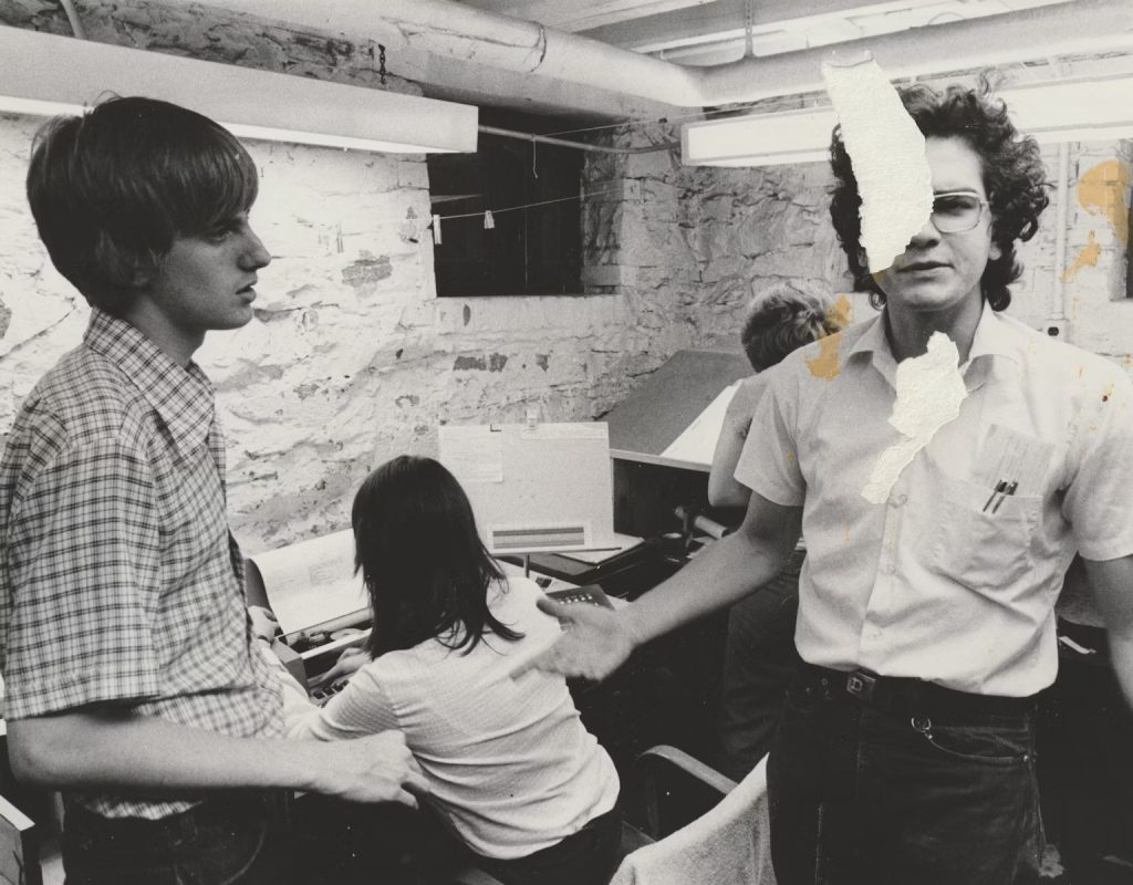
As you can see from the above picture, with Dante Landucci and Bob Fitterman discussing a problem with typesetters in the unkempt basement of the swampy N-L building (called the “Gatehouse,” incredibly, it still stands at the southern end of the Hopkins campus, even as building after building is constructed by the university, and I’d guess it’s only a matter of time before it’s razed), was a bare-bones place to work. Floods, “rats the size of cats,” no hot water and shady characters trying to break in at three a.m. were just some of the charms that were part of the bargain.
Hopkins had no journalism graduate school (or undergraduate classes), so this was a Tom Sawyer-like operation, unlike say The Daily Princetonian—once, in 1976, I disparaged that Ivy League paper and a week later received a huffy letter from its editor, who was in training for a “prestige” daily—and no one was paid except for the business manager, two “production assistants,” and the guy who drove the van to Westminster. We had a headline machine that fell apart every other week, which mechanic Dante would fix with a pencil and bubble gum; a couple of IBM Selectric typewriters, spitting out copy that was then pasted up on the “boards,” with one-line corrections affixed after space was made to accommodate the stories; and night-owl friends who dropped by with joints. (Not once was the material referred to as “content.”)
The fonts at our disposal, before an artsy comrade discovered Letraset at a big advertising supply store seven blocks south on N. Charles St., were standard: Bodoni, Helvetica, Cooper Black, Cheltenham, Garamond, Times New Roman and the like. We also had Peignot (a “with it” font in the 1970s, used for the credits on The Mary Tyler Moore Show), which was popular among the staff, not least because of the jokes as the sun was about to rise. A guy would say, “Get me a strip of lower-case Peignot,” and immediately a wiseacre would counter, “What, you talkin’ about your three-inch Peignot?” Depending on the mood, it was pretty funny. College humor, like when one night in my NL-attic office, a music critic/musician was late for a meeting. Asked about his tardiness, he said, “Sorry, I was blowing sax.” In a split-second, someone said, “Who’s Sax?” Double-over laughter.
In the fall of 1976, I stepped down from the NL editorship, and took a semester off to work in Denver at College Press Service, a “collective” of five that functioned as a hip Associated Press for college papers around the country. I returned to Baltimore in January, and secured a paid job at the News-Letter. In addition to leading the production of the paper twice a week ($3.75/hr., not bad), I headed up an ad-hoc operation called NL Hop Comp, which produced numerous campus publications and a high school newspaper from a girl’s Catholic high school nearby. (Every month, six or seven girls from the paper, awed, or disgusted, by the Gatehouse pit, would come in for two days, and unless I’m mistaken none of my colleagues preyed—other than look them up and down—on the ostensibly innocent girls.)
We produced the Humor Society’s parody of Rolling Stone, another well-paid job, and that was when the Letraset was first used, with particular emphasis on Shatter, a trippy font that I’d never seen. You had to be careful with Letraset sheets because they were fragile, and one flinch of a finger while rubbing a letter on the board would fuck it up, and this material wasn’t cheap ($4 a pop). As it happened, I had a steady hand—even after several cans of National Premium—and rarely goofed with the Letraset. I was also handy with a razor blade (we didn’t have X-actos yet) and could slit a column of copy in my sleep. I took to carrying two razor blades, and a pocketknife, in my jeans, which invariably resulted in bloody fingers when reaching for a pack of matches; but while the squeamish gasped when blood trickled from my hand, I just wiped it on my pants, and went on to another round of corrections.
In the summer of 1977, in-between issues of the then-biweekly City Paper, I worked on a number of projects that put my Letraset skills to use. I bought (always charged to the client) sheets that included Frankfurter, Clarendon, Sunshine, Superstar, Pump and Neon. Although I usually worked with a partner, I did a solo production number on a 76-page pamphlet for the Chaplain’s Office—Your Guide to Hopkins—and had a ball, not least for the $400 fee. A buddy gave me the assignment, and it took three weeks: writing the copy (with editorial snipes at student government clubs), fashioning a design (rudimentary with some twists), doing the paste-up and proof-reading. The headline on the cover was all upper-case Shatter, but the Chaplain, Dr. Chester Wickwire (a noble presence on campus, with boundless energy, despite his polio that required crutches, who was at the University from 1953-1984, and instrumental in attempts to integrate Baltimore), thought it “a bit ‘far-out, Russ’” and I switched to more palatable Frankfurter.
Otherwise, the pamphlet had almost no changes: it was completed, and I had no idea if incoming freshmen even read the text, aside from the basic information. Naturally, I was up against a deadline, and stayed up for 48 hours to fulfill my obligation. That night, relieved and exhausted, I went to a Ramones/Iggy Pop concert at Baltimore’s Civic Center—press passes!—and fell asleep 30 minutes after Iggy appeared, climbing on the amplifiers. Two hours later, a colleague—the guy who “blew sax”—said I missed a great show. Probably so, but I was glad to get the shuteye.
“Shattered In the Mid-1970s” ©2026. Russ Smith, The Renaissance Garden Guy, and Splice Today
Russ Smith publishes Splice Today. Follow him on Twitter: @MUGGER2023

The Renaissance Garden Guy is a participant in the Amazon Associates Program. As an Amazon Associate, The Renaissance Garden Guy earns from qualifying purchases.
Additionally, The Renaissance Garden Guy is a participant in the Bluehost, SeedsNow, and Hosting.com (formerly A2 Hosting) affiliate programs. The Renaissance Garden Guy earns a fee/commission each time a visitor clicks on an ad or banner in this site from one of these companies and makes a subsequent qualifying purchase.
Please click here to view The Renaissance Garden Guy Disclosure page.


Ah, Letraset. Fond memories. Our wedding invitation was painstakingly done with Letraset.
Thanks for reading and commenting. I’m replying by proxy on Russ’ behalf. Hope you don’t mind. He’s usually super-busy as the publisher of, and regular contributor to, Splice Today (and activities associated with his duties as former publisher of four East Coast newspapers/author of the MUGGER column in New York Press). It’s a real honor and pleasure to feature his work here in The RGG, and he always reads and appreciates readers’ comments, so I in turn am happy to reply to interesting comments (like yours) on his pieces here if he himself can’t do so himself right away. It’s very interesting to know that your wedding invites were done with Letraset. I’d never heard of it until Russ wrote this piece, and was surprised by the number of readers here who are familiar with it. I’m betting those wedding invitations weren’t cheap. It’d be very cool to see a photo of one. If you’ve got one, feel free to send it in. We’ll run it in a follow-up to Russ’s piece. Thanks again for reading and for leaving your thoughts here. Russ will definitely be happy to read them, and I’m sure he’ll be impressed by the layout and composition of your invites. Cheers!
Wow! There sure was an insane amount of work required to get a paper or publication to press in the mid-70s, as you describe. It’s sad to think that printed newspapers and other printed periodicals are becoming a thing of the past. Your article opened my eyes to the huge amount of effort and dedication that went into those printed publications. Great read.
John Stamos here, Kevin. I hope you don’t mind my chiming in. Trust me when I say that from the standpoint of my own experience as a digital publisher, the level of effort, committment, and diligence that Russ and his colleagues demonstrated back then is virtually incomprehensible. Those traits have been a hallmark of Russ’ professional career and have, along with his talent and intellect, contributed mightily to his many successes.
Technology is changing things on a daily basis. 1970’s recollections seem historical today. Many thanks for your heart felt article.
John Stamos here, Rick. I agree. I would guess that the processes (and the elbow grease, blood loss, etc. that accompanied them) involved with publishing a periodical in those days, as Russ explains them, are unimaginable to the digital publishing vanguard of today. Thanks for reading and commenting, Rick.
I think I remember the Letraset sheets from graphic design class in high school. How times have changed!
Hey, Lisa, John Stamos here. I’m taking the liberty of replying. Hope you don’t mind. I was intrigued/amazed by Russ’ story, and by the comments from others (like you) who’ve had similar experiences. Russ’ story, and corresponding comments, make me realize that the conveniences of digital publishing are taken for granted. They are by me, in any case. Thanks so much, Lisa.
Russ, interesting article. I worked in classified advertising in the 80s. Had to do my own layouts for special sections. Thank goodness for the typesetters. Your article brings back memories of working at a “rag” (Palo Alto Times –> Palo Alto Times Tribune). What a story to tell- falling asleep on the Ramones and Iggy.
Hey, Lane, John Stamos here. This story was fab. Loved it. You’ve probably got some stories of your own from your days at the PATT. Very cool. Also, I can’t imagine falling asleep on acts like The Ramones and Iggy Pop. Shows you how hard Russ worked back in the day (and still does).
I am impressed he stayed up for 48 hours to make a deadline. Dedication!
Totally. He’s a publishing legend and an awesome writer. I used to read his MUGGER column in NYP whenever I was in New York. Most importantly he’s a great guy. I’m happy you liked this one, Lane, and I’m glad you mentioned your own experiences in the world of newspaper publishing. Gotta hear more about that one of these days. Thanks, Lane!